Hello again!
Today I’ll speak about the ongoing details study for terrains and props.
Our game is ‘graphically essential’ and deliberately low-poly: being based on essential shapes doesn’t mean you don’t want details or small chunks of debris or whatever will give a better look to your scene.
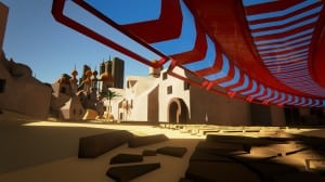
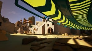
Let’s have a look at the following two screenshots:
Forget for a moment the difference in color scheme. Do you see the sand? Moving from completely flat to a waving and more realistic feeling?
Placing a bunch of debris and sculpting a little bit the terrain around the houses gives to the scene a more believable appearance: some occlusion kicks in where the buildings touch the ground and the absence of the straight line is way more “natural” for the eye.
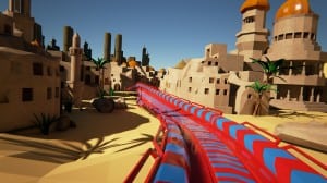
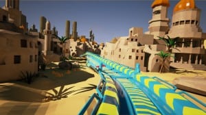
Another example?
Quite similar, but the little differences here and there create a completely new feeling, when you pay attention.
-Peace-
Budello


